Hiya Connect
Assessing the usability of Hiya Inc.'s new B2B call analytics dashboard


01 | Overview
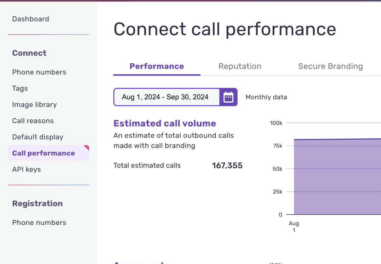
Hiya Connect is a dashboard that allows call center employees to assess their call performance and other metrics such as call volume and answer rate. My team was tasked with assessing the latest version's usability, as it was released in January 2024 without robust user testing.
Goal
Identify any friction points in the interface by gathering participant feedback on reporting features, data visualizations, and overall dashboard navigation.
Outcome
We provided Hiya Inc. with 8 design recommendations to improve its platform. Many of these were implemented by the design team within a few weeks of our presentation.
For this project, I owned:
Creating design recommendations
Passed off 8 design recommendations which were delivered to Hiya Inc.'s research and design team
Research planning and facilitation
Led development of research plan and study kit. Facilitated usability tests. Managed and scheduled interviews via usertesting.com
Role
Team lead, designer, researcher
Team
2 researchers, 3 designers
Context
Sponsored graduate project
Duration
Jan - Mar 2024
Skills
Heuristic evaluation, evaluative research, user interviews, analysis
02 | Research planning
Research questions
While we wanted to test for the platform's overall usability, we wanted to specifically answer:
Can people confidently navigate the platform in order to run a report for a specific time frame and interval (weekly, monthly, etc)?
Do people understand why they would use the dashboard versus performance analytics and vice versa?
Do people understand how to interpret data visualizations?
Do people understand what "low call volume" means and what to do next?
Do people understand how margin of error impacts the confidence in their decisions?
We conducted:
1
1 Heuristic evaluation
This helped us familiarize ourselves with the platform
5
Cognitive walkthroughs
Conducted via Zoom with call center managers.
3
Likert scale questions
Measured difficulty, likelihood of use, and comparison to other analytics platforms.
10
Task success metrics
We recorded pass/fail criteria to evaluate task success.
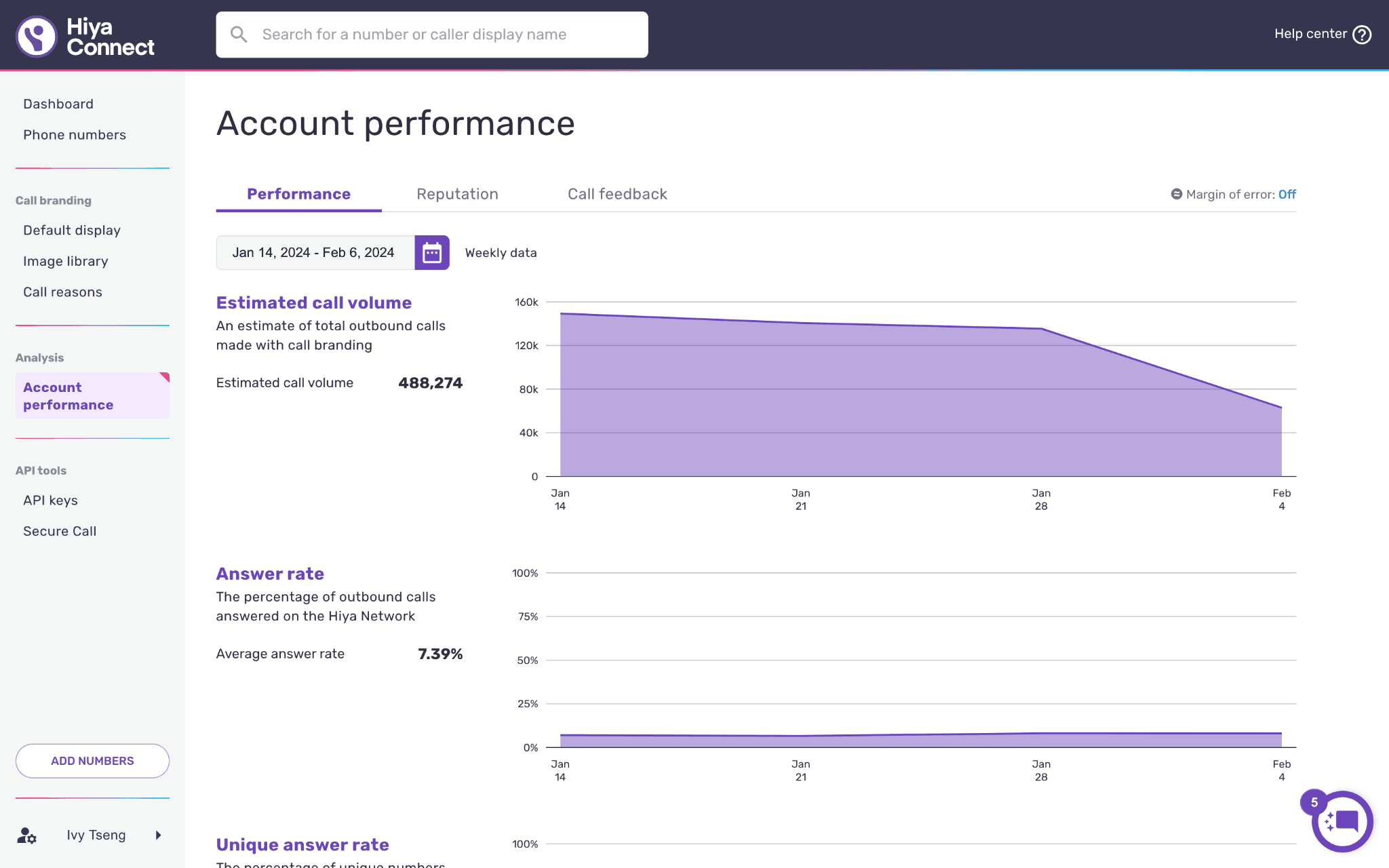
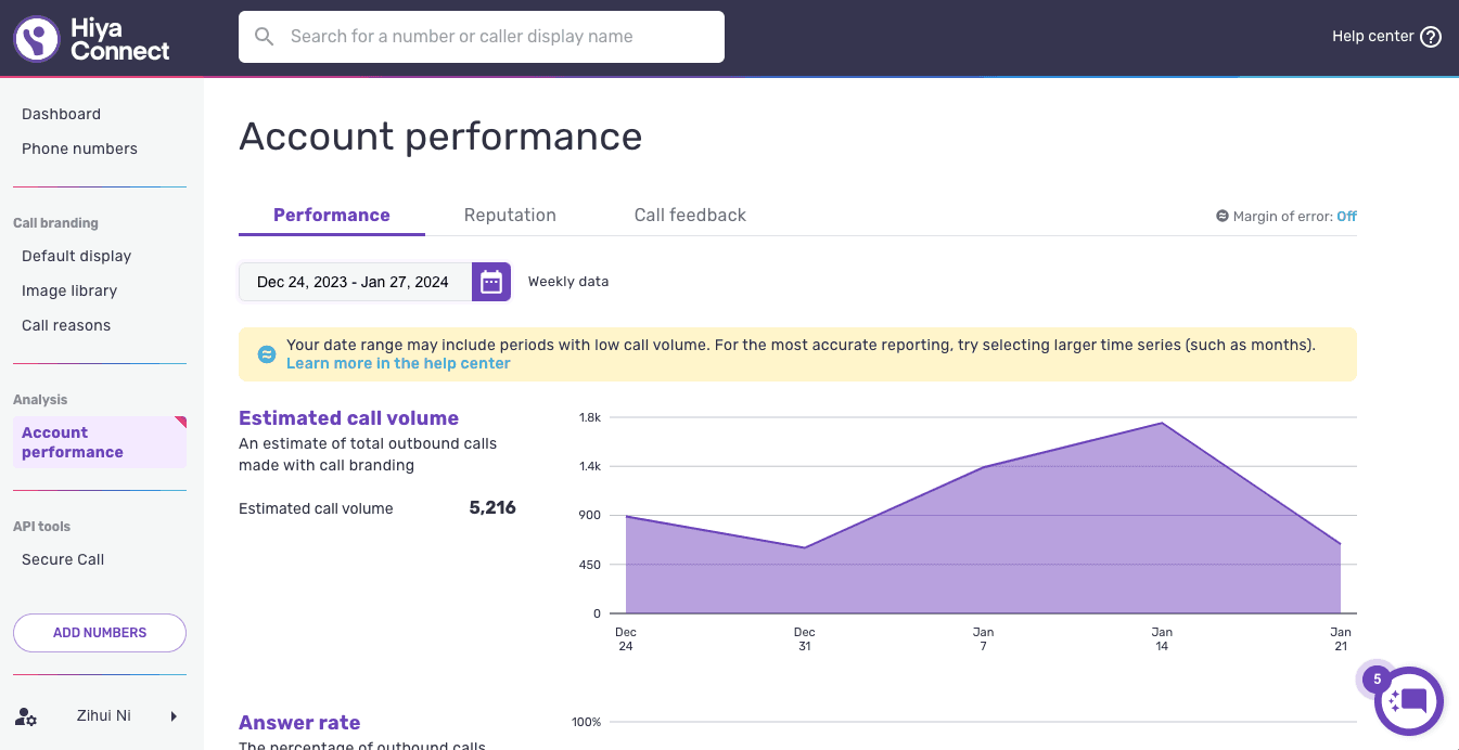
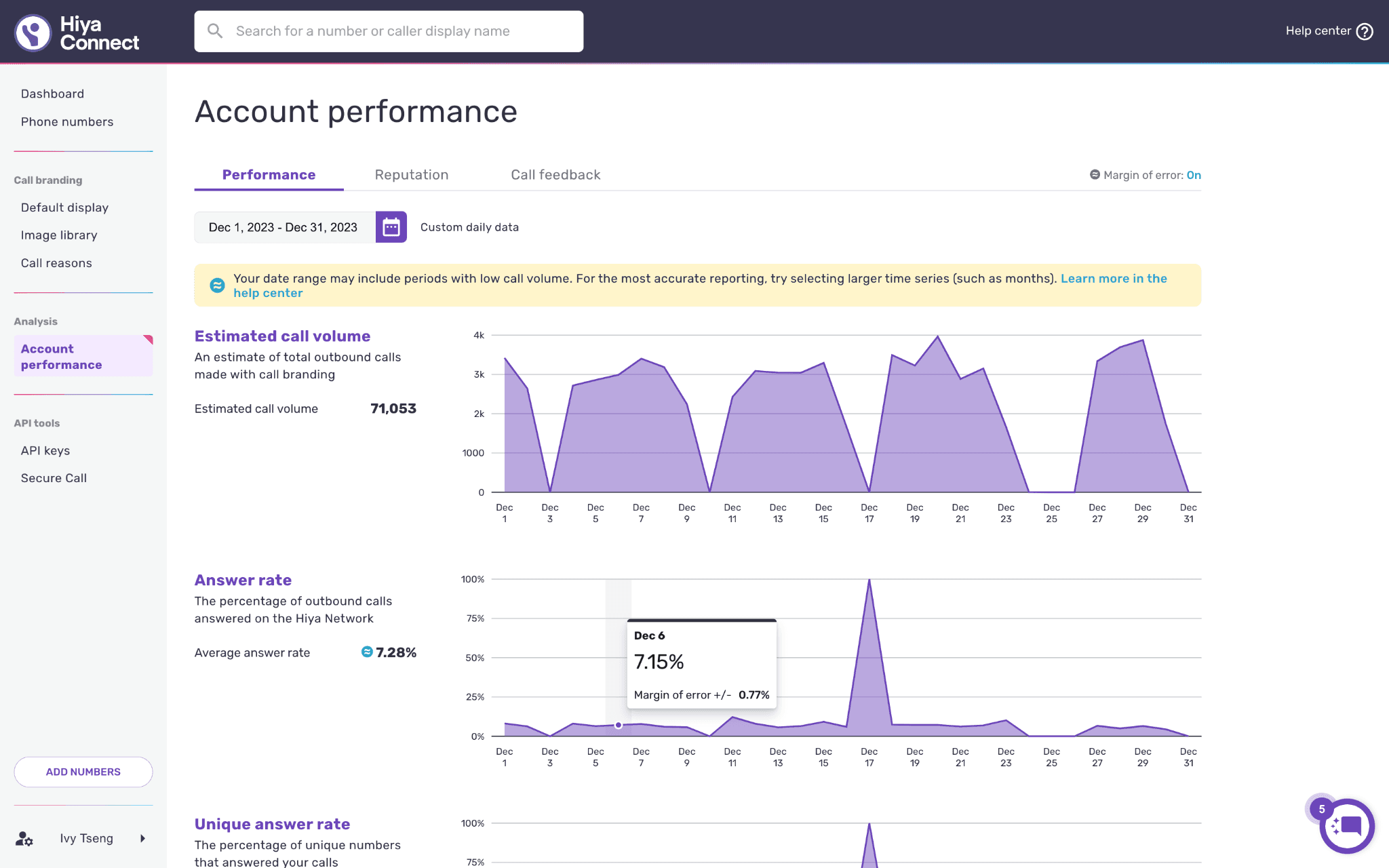
03 | Usability testing
Testing objectives
We evaluated participants' abilities to:
Navigate the platform
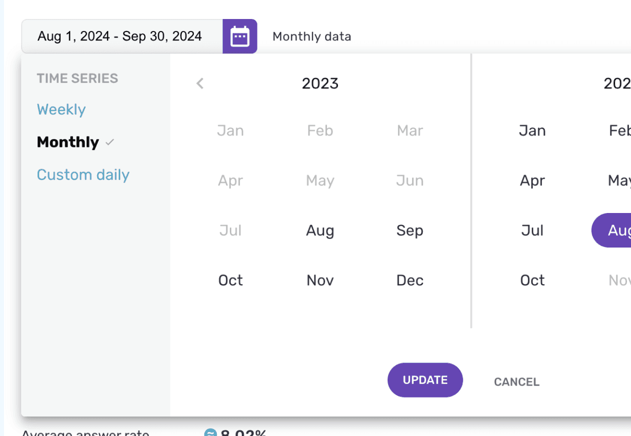
Use the calendar/date selector
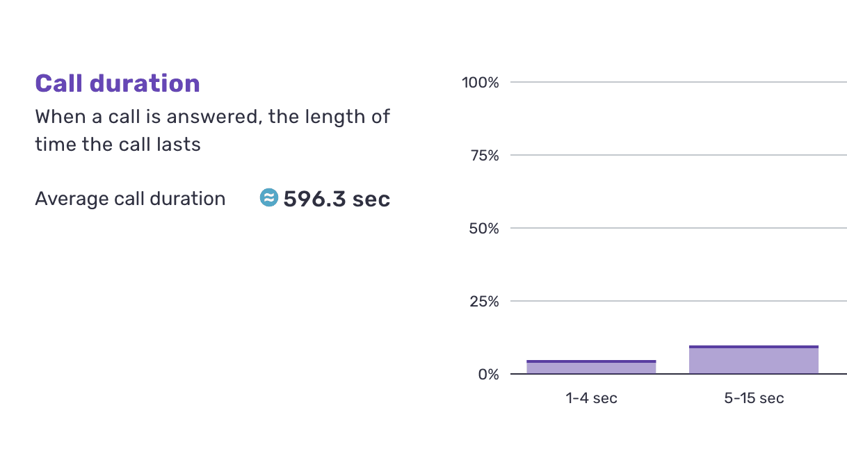
Interpret data visualizations
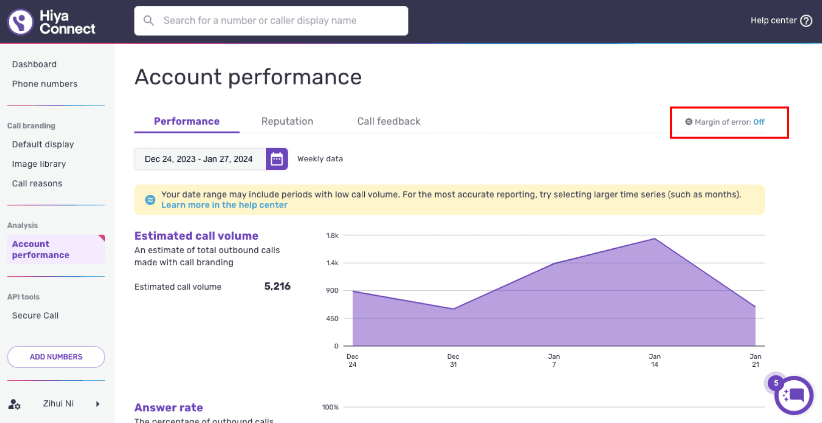
Interpret pop-ups and banners
Scenarios
We created 3 scenarios (A, B, C) to walk each participant through. We alternated between starting with Scenario A and B for different participants. Scenario C was only implemented if participants hadn't independently discovered the margin of error toggle during the first two scenarios.
A. Enough data
In this scenario, there's enough data for participants to interpret metrics and draw accurate conclusions.
B. Low call volume
In this scenario, there is not enough call data and a "low call volume" message will appear.

C. Margin of error
If participants haven't discovered this toggle component on their own, we will prompt them to engage with it.
Tasks
Scenarios A and B involved the same 4 tasks:
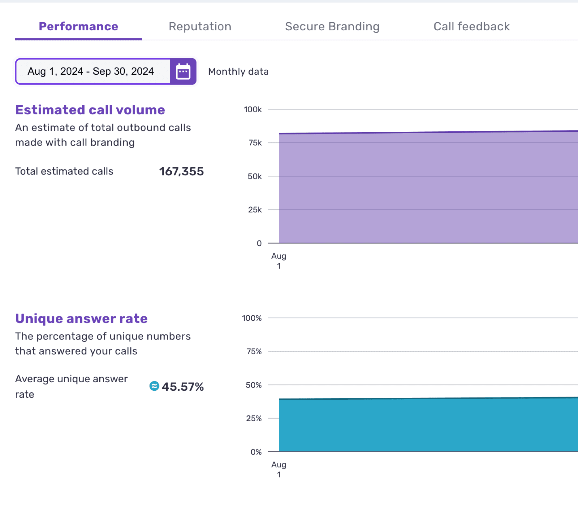
04 | Results
Analysis
After conducting 5 usability tests, we examined our notes and transcriptions to pull out memorable quotes and observations. We also calculated our Likert question results and task success rates.
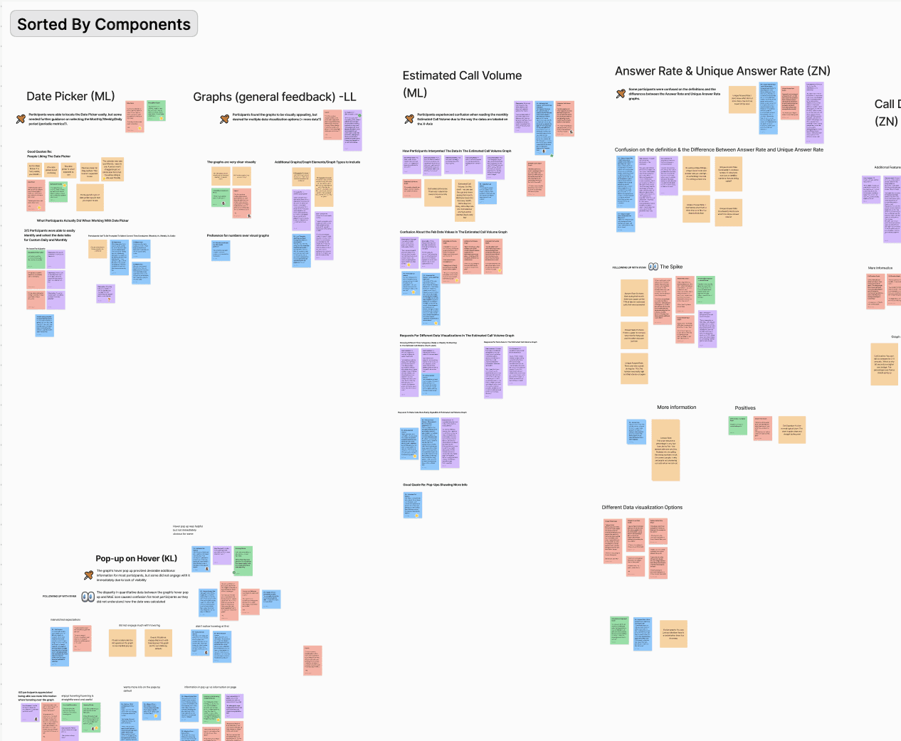
Categorizing our notes in FigJam
04 | Findings
FINDING #1
Participants question the Margin of Error feature because it appears in some graphs and not others.
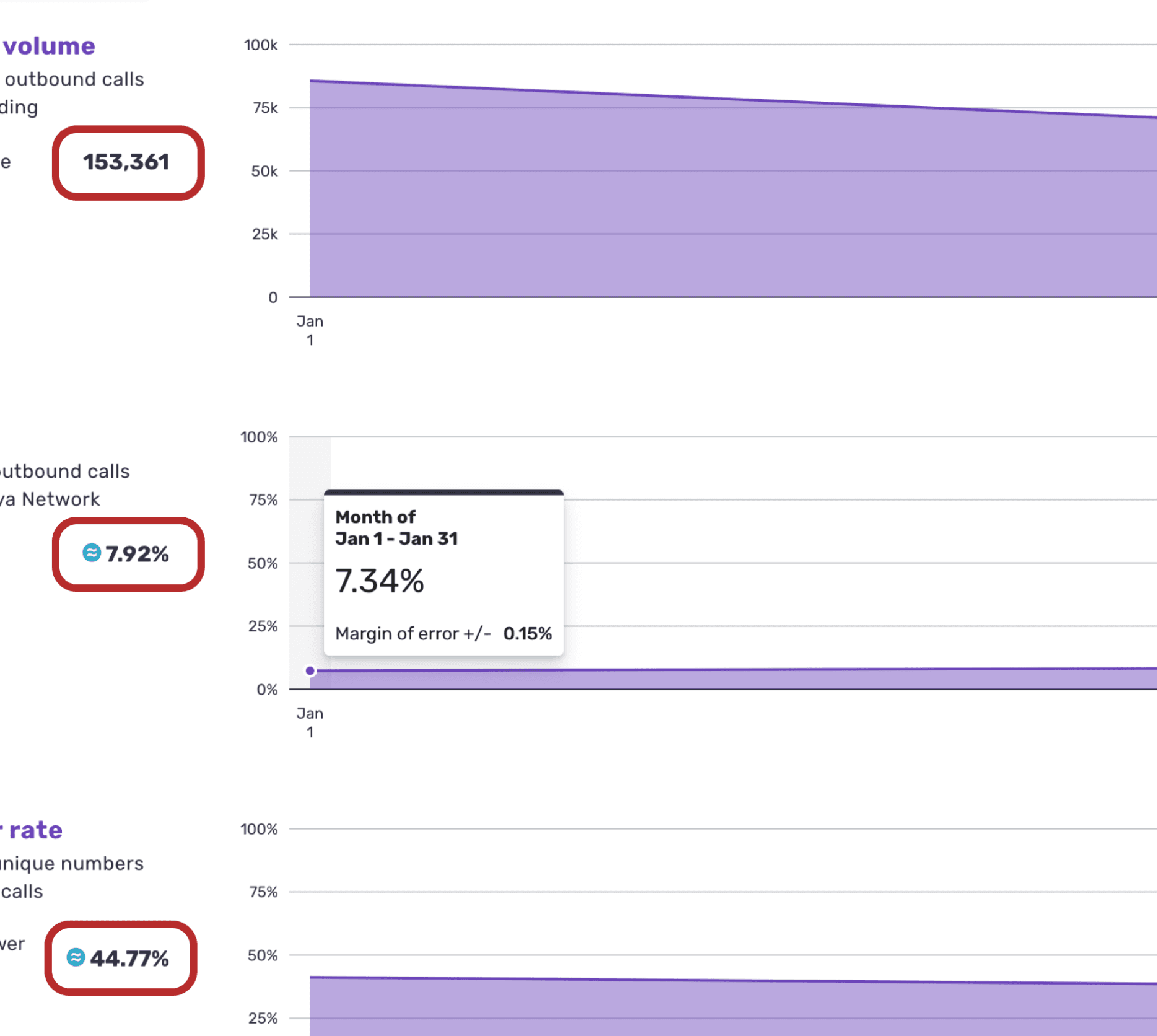
Margin of Error indicator

Inconsistent indication of Margin of Error's presence
"If I have Margin of error for some and not all…it just causes more questions than gives answers." (P4)
“I don’t see any change from what we had previously. It still looks the same.” (P5)
RECOMMENDATION
When the Margin of Error toggle is on, adjust the graph colors to that of the blue Margin of Error icon for increased visibility.

Original design
Making the affected graph a different color
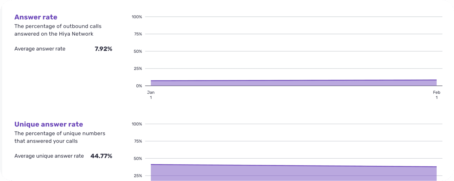
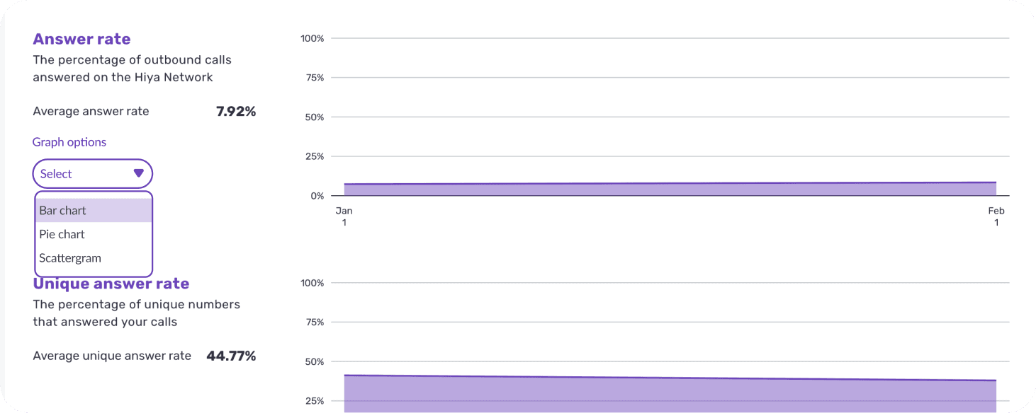
FINDING #2
Participants wanted more data on the graphs and multiple data visualization options, similar to that of standard reporting tools.
“I was just trying to click to see if it gave me a further drill down or gave me any more information, but it didn't respond.” (P4)
“...some people like pie charts, some people like bar charts, some people like line charts. Some people like scatter grams. I mean, it all depends on what you're doing.” (P2)
RECOMMENDATION
Add a dropdown menu next to the graph’s informational section which allows participants to select different data visualization options.
Original design
Making the affected graph a different color
FINDING #3
The pop-up windows had low discoverability at first glance.
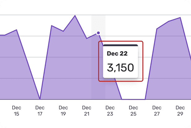
Pop-up window
“As I hover over the graph, it actually does give me the numeric data I was looking for. I didn't realize that it did that as far as the dates so that piece is helpful.” (P4)
“Without hovering, it just gives you an overview, but if you want to really know…it can make a difference when reporting.” (P1)
RECOMMENDATION
Add a line of instruction under the date picker that lets participants know they can hover over all the graphs on the page to see specific data points.

Include a line of instruction
09 | Outcome
Executive presentations
We presented these findings in front of senior designers and researchers at Hiya’s offices in downtown Seattle. Our design recommendations were well-received:

End of a great project!

Testimonial from industry sponsor
10 | Reflection
Pilot tests
We ran 3 pilot tests prior to our scheduled interviews. This helped us identify and troubleshoot logistical and technical issues.
Thinking on my feet
Overall, our tests ran smoothly. Some interviews followed the script and scenarios closely, while others required us to adapt on the spot to address our research questions without being too transparent or awkward. It provided valuable interview practice, teaching us to actively listen and process participant responses while maintaining a natural flow.
Understanding test data
If we were to do this again, I would have had our team take more time at the beginning of the project to understand how the test data affected each visualization. Because we weren’t looking at real data, one of the graphs that were portrayed looked odd; this came up in one of our tests as we thought the user was struggling to interpret the visualization; however, it was actually the result of the test data.